Morganix Design
Graphic Artist - Front End Developer - UI/UX Designer
Aspiring to greatness, a new face in design...
My name is Morgan, and I create interface experiences.
Aspiring to greatness, a new face in design...
My name is Morgan, and I create interface experiences.

My name is Morgan Payne. I am an up-and-coming Designer/Developer of the web based in Germany. Fresh out of college, I seek to cultivate a design aesthetic that is thoroughly "Morganix"—simultaneously uniquely my own, iconic, and highly useful and adaptable to the needs of clients current and future. I'm making my way in a competitive field, but I am ripe and ready to tackle the market.
I love that this field is one that caters to generalists. I intend to take on diverse projects with diverse people to learn the nooks and crannies of design for electronic media. My next step is to branch out in as many ways as I can. I will strive to create iconic and interactive experiences using CSS libraries and JavaScript frameworks, transform still graphics into motion graphics, and blogging about all of it come 2019.

2018
Created for a client.
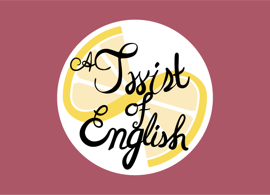
A Twist of English: A Visual Pun for Lovers of English Wordplay
The twirly-twisty "Twist of English" is a visual pun designed for a blog dedicated to wordplay. The curling, calligraphic text was first inspired by looking at bits of lemon rind, and is meant to further reinforce the twist users are riding. A lemon twist is tasty, just as the twists of English contained in the blog are implied to be. The lemon slice itself is twisted, further pressing the visual pun and adding a further zesty enticing feel to an already playful logo. Overall, "A Twist of Lemon" is offering viewers fun, so come in, have a twist of English!
Close Project
2018
Created for a client's event concept and CMST 320 (Illustration Graphics).
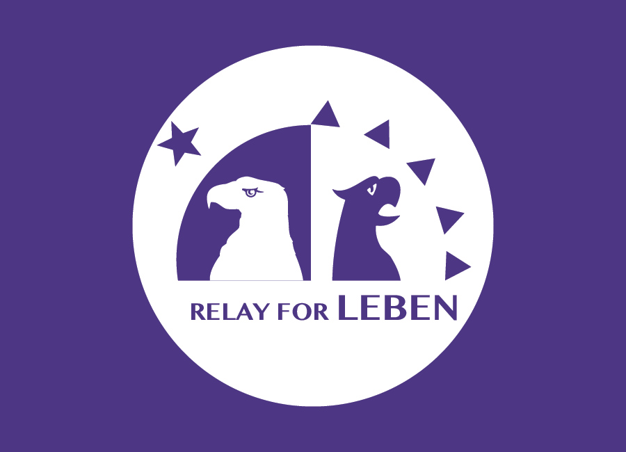
Relay for Leben: Germans and Americans united in the Fight against Cancer
"Relay for Life" is a community-based fundraising event for the American Cancer Society. Every year, thousands of relays are hosted. Participants walk along a trot in a marathon that lasts overnight, to symbolize that cancer never sleeps. When I was looking for ideas for projects in my first imaging class at UMUC, a friend approached me about the idea for a German-American spin on the event, that would bring Germans and Americans alike together to fight against cancer. I got to work immediately to create a vector logo to scale for T-Shirts and posters. The logo brings the two eagles of our countries together to stand watch through the day and the night. Relay for "Leben"—the German word for life.
Close Project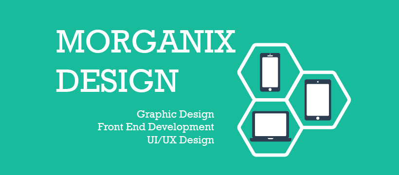
2018
Created for the Morganix Design Facebook Page.
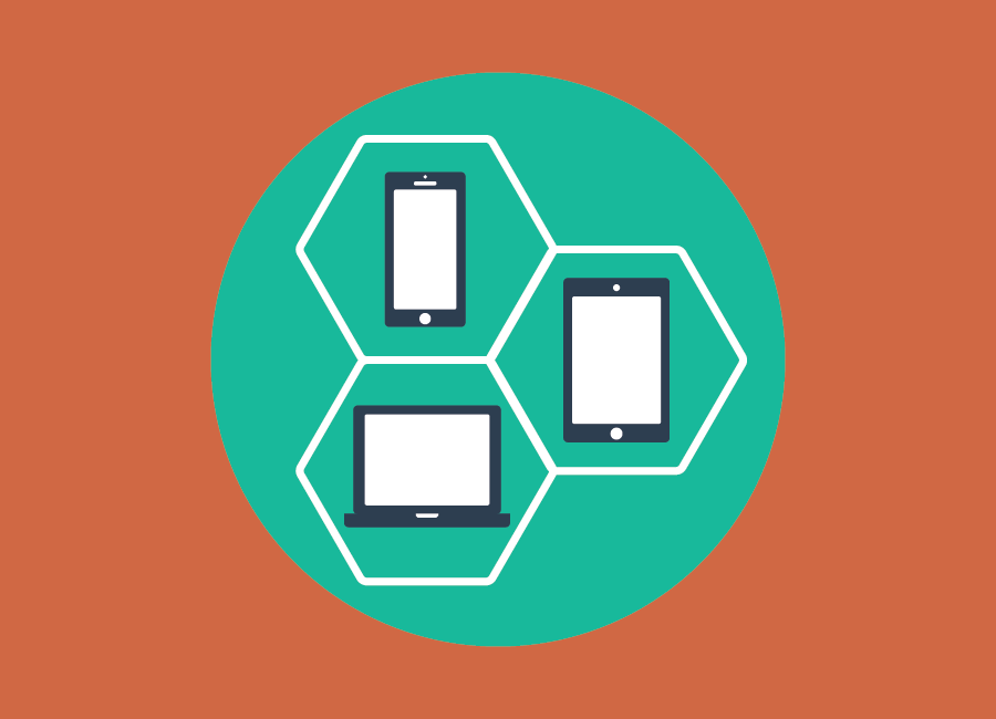
Morganix Design: Organic Interface Experiences
A simple banner, the core of this design is in the icon: resposnive design. The simple composition is itself designed with multiple devices in mind: Facebook covers have different dimensions for mobile devices. The banner visually states Morganix Design's commitment to responsive, organic interface experiences: nestled in the "organic" design of the hexagons (organic like honeycomb, organic like organic chemistry, organic like nature) are a phone, a tablet, and a laptop. The banner backs up its message a simple yet modern font that evokes the simplicity of vector. Morganix Design is committed to responsive design, and will bring graphic art, front end development, and ui/ux design to every device to create powerful Interface Experiences.
Close Project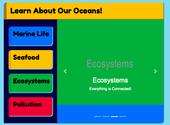
Desktop.
Mobile.
2018.
Originally developed for CMST 488: Advanced JavaScript.
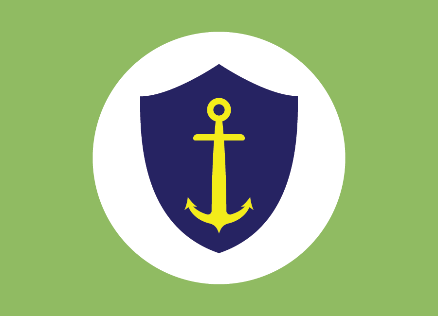
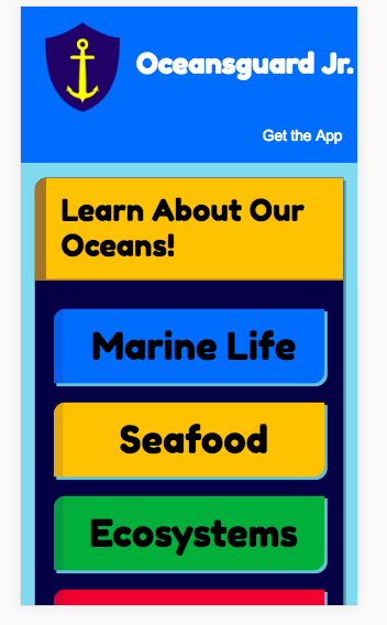
Oceansguard Jr.: Learning about the Oceans and How to Protect Them
The Oceansguard Jr. concept was designed with children in mind. The retro look of the app was meant to be appealing to adults’ sense of childhood. The website was designed to be used and delightful whether used on a personal computer or mobile device. The web application, which had clear visual indicators so that children had a clear sense of where they were. The logo captures this simply concept of protecting the oceans thus: a shield, protection. An anchor, the ocean. Some basic colorcoding was tooled from Bootrap's color schemes: green for the environment, red for pollution, blue for marine life, yellow for our eating marine life. Interactive components via JavaScript, jQuery, and AJAX were meant to keep attention and direct users to the next flow, delighting users at every step.
Close Project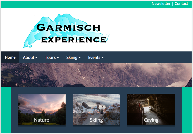
Desktop.
Mobile.
2018.
Retooled from a website created for CMST 486 (Principles of Web Technology II).
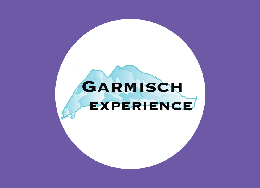
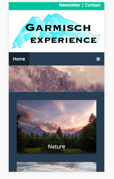
Garmisch Experience: a Travel Website Concept.
Garmisch Experience is meant to draw users into the wonder of ice, caves, river, forest. The wilderness of Garmisch is displayed in photos and the logo. The logo's letters are big and bold, like the mountains of Garmisch, the blue iciness of the mountain captured in the gradients that make up the mountain. Text is placed over the pictures, so that emphasis is placed on experience, on the visuals that await travelers who are willing to experience Garmisch. The pages contained delve into experiences of the beauty of Garmisch, from hiking to skiing to caving. A simple hover effect when users mouse over the photographs, making the overlaid text at 100% opacity, further emphasizes photos, real rather than abstract experience.
Close Project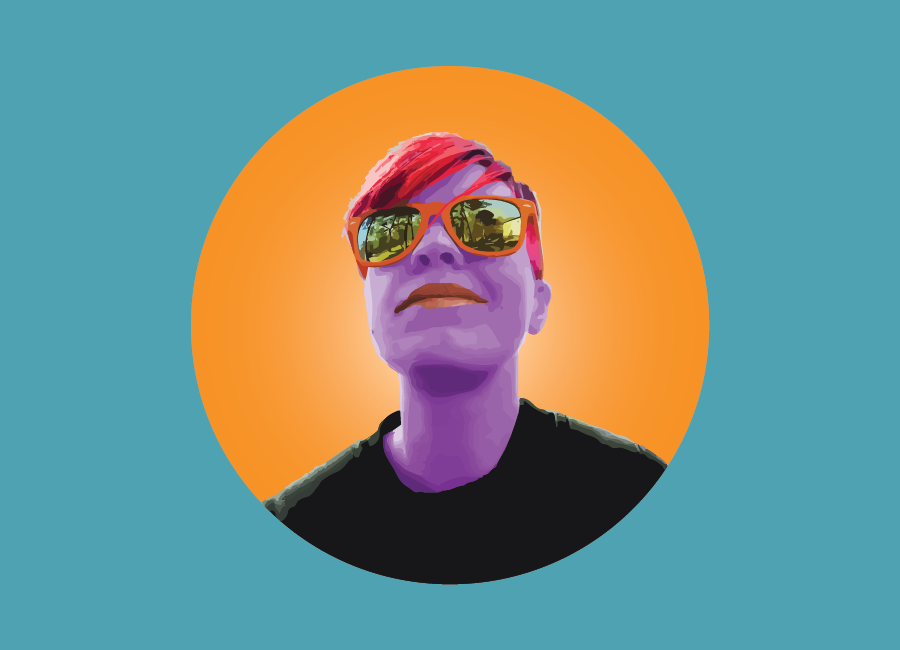
2018.
Created for the CMST 495 Portfolio.
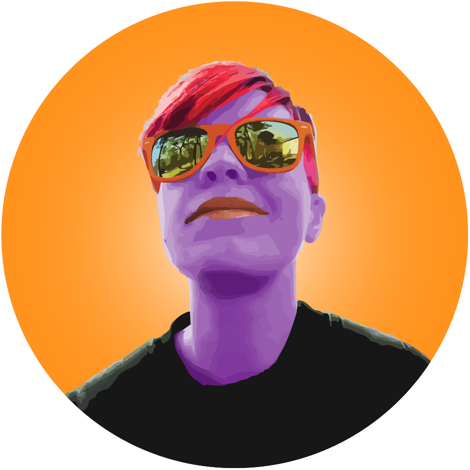
The glowing-bright Morganix Morgan: bringing together technical skills and artistry to make others see the world through content creator's vision.
Whenever one enters the world of business, one is branding oneself: our face is no longer just our own. It is a symbol. Names in design must come attached with ideas and reputations, and some choose to omit their own face entirely, letting their personality come out in other ways. Others create highly stylized pictures to capture the essence of who they want customers to experience. I wanted to capture my playfulness and my vision.
As a creator, I want to stay cutting-edge. These days, both digital paintings and simple stylized graphics are trending. I want to create streamlined and elegant solutions for my clients and incredible interface experiences for users, creating user interfaces and digital architecture both. Bringing together the tools of Web Development, Graphic Design, and UI/UX Design, I can invite people into fantastic experiences for art and business.
As for my Morganix Selfie: the original selfie, taken on a bright spring day, stood out by itself for the reflective glasses that contained the surrounding sky and pines so clearly. Taking away the surroundings, abstracting skin, leaving only the world reflected within, I invite viewers to see the world reflected through my lenses. I am suggesting the power of myself as a designer of the visual: I can take people on journeys with me.
Morgan, IX: Interface Experiences with Morgan.
Close Project